
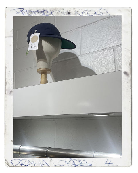
why 199® stays quiet
most brands use plastered logos as a shortcut. a visual scream. a way of compensating for the fact the product underneath has nothing to say. if you need a giant wordmark across the front of an item to make it noticeable, the product is already worth unnoticing.
that’s the truth nobody cutting garments wants to swallow.
they’ll dress it up as “branding” or “heritage visibility” or “identity expression.” it’s none of that. it’s thoughtlessness stitched in oversized embroidery.
199® exists in the opposite direction.
minimal design isn’t an aesthetic choice for us. it’s a position. a refusal. a rejection of noise.
we don’t want to be seen from across a room because of a logo. If that’s your goal, you’re building uniforms for people who don’t know how to think for themselves. the plastic authorities and alike.
we are not interested in uniforms.
we are interested in objects that hold presence without begging for attention.
that is a completely different discipline.
most brands misunderstand minimalism. they think it means “make it clean” or “reduce details” or “go tonal and call it premium.” that’s surface-level isht. college graphic design for people who don’t understand product integrity.
199® minimalism comes from restraint built on refined taste.
we strip things back because everything unnecessary is noise.
and logos are usually noise.
a big logo does one thing: it tells the world you’re wearing a brand before you’ve earned any connection to it. it removes curiosity. it kills discovery. it flattens experience into instant recognition.
we’re not interested in instant anything.
we want people to look twice.
not because something is loud.
because something is different enough to feel off in a good way.
that’s where real presence lives.
not in shouting.
in control.
we loathe big logos because they interrupt the relationship between object and wearer. a hat should sit on the head, not announce itself like a real estate billboard. it should integrate into identity, not replace it with corporate signage.
when a logo becomes the main event, everything else becomes secondary. fit stops mattering. construction stops mattering. shape stops mattering. all that’s left is surface recognition.
that is not design.
that is branding panic.
199® was built from a completely different starting point: obsession with fit, silhouette, structure, and history. the kind of taste that takes years to develop properly. the kind that cannot be rushed through trend cycles or forced through marketing decks.
when you spend years refining the shape of headwear, you quickly realise something most brands never learn:
if the product is right, it doesn’t need help.
it doesn’t need decoration.
it doesn’t need distraction.
it doesn’t need a loud front panel screaming for validation.
it just needs to exist correctly.
minimal design is what happens when you stop lying to yourself about what matters.
most fashion companies use logos because they don’t trust their own product. If the silhouette is weak, the fabric is average, the fit is generic, then you compensate with identity branding. you print meaning onto the surface instead of building meaning into the structure.
we don’t do that.
we build meaning into the structure.
then we remove everything that gets in the way of it.
that includes ego-driven branding.
that includes oversized marks.
that includes anything that turns the product into a walking advertisement.
199® pieces are not designed to advertise oneninenine®.
they are designed to represent it quietly.
the irony is that people think minimal design makes you harder to notice. that’s wrong. it makes you harder to ignore.
there is a difference.
loud design gets seen quickly and forgotten faster.
minimal design stays longer in the mind because it doesn’t resolve immediately. the brain keeps returning to it, trying to understand why it feels different.
that’s where 199 operates.
we don’t want instant recognition.
we want delayed understanding.
because delayed understanding means the product actually had depth.
now let’s talk about what we actually use instead of big logos.
the rear noose.
that detail alone says more about 199® than any front-facing branding ever could.
it is discreet. it is engineered. it is intentional. and it is only understood when you’re close enough to the product, not when you’re scrolling past it on a screen.
that is the entire philosophy in physical form.
most brands design for the feed.
we design for proximity.
the patented rear noose detail is not decoration. it’s structure, identity, and signature compressed into a single functional element. it sits where most brands do nothing. the back of the headwear is usually dead space. wasted territory. forgotten real estate reserved for size tags and cheap adjustment systems.
we don’t waste it.
we use it as identity.
because if you understand headwear properly, you know the back matters as much as the front. the way a cap sits from behind. the tension across the adjustment. the silhouette it creates in motion.
that is where real design lives.
not in the billboard zone.
but in the detail zones nobody bothers to think about.
the noose is deliberately understated because it doesn’t need to prove itself. people who understand design will notice it instantly. people who don’t will miss it completely. both outcomes are intentional.
we are not designing for everyone.
we are designing for recognition through understanding, not exposure.
big logos do the opposite. they remove interpretation. they force recognition. they eliminate ambiguity. there is no discovery. no learning curve. no relationship forming over time.
just instant consumption.
then instant disposal.
that cycle is everything wrong with modern streetwear.
199® rejects it completely.
minimal design forces patience. it forces attention. it forces people to actually look at what they’re wearing instead of relying on a symbol to do the thinking for them.
we are not interested in headwear that makes people feel “included.”
we are interested in headwear that makes people feel aligned.
there is a difference again.
inclusion is mass-market thinking.
alignment is cultural understanding.
the people who connect with 199® don’t need logos to validate identity. they already understand silhouette, proportion, and detail. they understand that the shape of something says more than a word printed across it ever could.
that’s why we don’t chase visibility.
we chase recognition from the right people.
and the right people don’t need it spelled out.
they notice the cut.
they notice the depth.
they notice the restraint.
they notice the absence of noise.
then they notice the rear noose.
that’s the moment it clicks.
minimal design is not about being subtle for the sake of being polite. it is about removing everything that doesn’t deserve to be there.
if something is loud, it better be necessary.
sometimes it's better to stay quiet.
this is why old military gear, vintage workwear, and archival headwear still looks relevant decades later. because it was built on function, not branding theatre.
we sit closer to that philosophy than anything in modern streetwear.
even when people try to copy minimal design today, they usually get it wrong. They remove logos but forget to add meaning back into the structure. So the product ends up empty. flat. soulless. minimal without intention is just laziness dressed as sophistication.
199® avoids that completely.
our minimalism is dense, not empty.
every decision is intentional.
the absence of a big logo is not a lack of identity.
it is the identity.
and that is where most people misunderstand us.
they think we are being quiet because we are trying to be premium.
we are not.
we are being controlled.
if the shape is right, you don’t interrupt it.
if the fit is right, you don’t distract from it.
if the structure is right, you don’t bury it under graphics.
the rear noose exists as the only signature because it respects distance. it doesn’t demand attention. it reveals itself slowly. it rewards proximity. it respects those who take the time to actually look.
that is the opposite of a big logo.
big logos want attention from far away.
we want understanding up close.
one is shallow.
the other is earned.
199® doesn’t loathe big logos because of style preference.
we loathe them because they replace thought with branding.
and we didn’t spend decades understanding headwear just to cover it up with noise.
we built something that stands on its own.
quietly.
precisely.
and deliberately.
if you need a logo to see it, you were never the audience anyway.
— oneninenine®
shipping
this is a bespoke service. every piece is carefully packed in-house at 199®. we offer free shipping australia-wide
view our shipping policy.
delivery
199® offers free shipping australiawide. if you need it hustled we can organise express
view our offers page.
returns
we've spent years refining the shapes of our headwear. we accept returns for any flaws in the build quality
view our returns policy.
about oneninenine®
sign up
Link to your privacy policy.